“Too many pages of Easy Read are boring and stressful. We won’t read them.”
That was the loud and clear message from the Staying Alive and Well group. They are my colleagues with a learning disability who help us with jargon-busting saying easy words.
There are seven people with a learning disability in the group. They looked at different examples of making complicated information easier to understand and then held a series of meetings to ask ten other people with a learning disability for their opinion.
Easy Read came third on the list of preferences, after ASKING SOMEONE TO EXPLAIN and VIDEOS.
Easy Read was developed for people with a learning disability to help them understand important information. It uses short sentences, easy words and pictures. If you’re new to this concept, you can google it or read more about it on this page from PhotoSymbols (we, along with many others, often use their brilliant pictures).
“Translating” important but complicated documents into Easy Read is definitely 200% better than having no easier-to-understand information at all. In fact, when a new and important document is published that concerns people with a learning disability, I tend to go to the Easy Read version first.
But how easy is Easy Read for people with a learning disability? Is it easy enough? Is there any way of making it even easier?
This is what our groups said, having looked at different types of Easy Read documents as well as other formats of accessible information (stories, picture books, videos):
Easy Read is OK. Some people really like it. They are used to it. They want to see more of it.
But it needs to be short – just a few pages. No more than five pages.
If it’s longer, split it into different parts, with colours.
And please, could you also put the Easy Read information on a video.
We asked the question as part of a Finding Out More* mission: “What is the best way for you to find out more about diabetes?”
*We’ve dismissed DEEP DIVE as definitely not being easy
It made us think, not just about diabetes, but about everything we try to make easier to understand. So now we were faced with a serious challenge. Can we put our money where our mouth is?

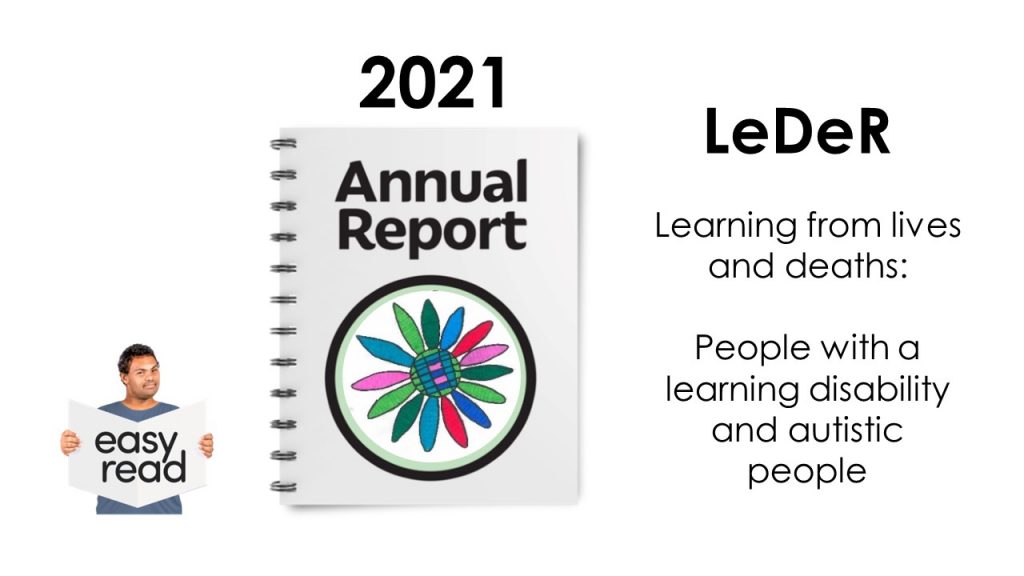
The next task for the Staying Alive and Well group was to make the LeDeR 2021 Annual Report accessible. It definitely – DEFINITELY – ticks the box for being important to understand. It analyses what happened to 3,304 people with a learning disability who died in England in 2021. What did they die of? How old were they? Who was most at risk from what? Lots of questions, and crucially this one: How does that compare to people in the general population?
The full report is 93 pages long, and that’s not counting all the extra bits (“See Appendix” etc). It’s packed with complicated numbers, tables, pie charts, and complex explanations. But at the heart of it, there are people who lived, were loved, and died. That’s the awful part. We are talking about people, yet we have to look at numbers. It’s important to understand the implications of the numbers. The implications have stayed distressingly similar, year after year of LeDeR reports, so really, it is saying nothing new. Until the numbers change dramatically and the need for LeDeR is eliminated, we need to keep reporting and we need to keep making sure that is is easy to understand. (Are deaths ever easy to understand? Especially avoidable deaths?) However frustrating that change is slow, or you might say non-existent.
We were helped by the efforts of those who produced LeDeR’s Easy Read reports in previous years. They included a lot of detail, which was an advantage but also a disadvantage, as it took it the Easy Read documents to well over 40 pages. How on earth could we distill all this in the few Easy Read pages people said they preferred? We worried about leaving too much of the detail and nuance out of it. But in the end, we agreed that having a few pages that you might actually engage with is better than feeling so overwhelmed by the information that you don’t take any of it in.
This is the first year that the new Staying Alive and Well group had this job. I’m grateful to the group members, because thinking about so many people dying is not easy. Not ever. Especially if this could be about you. Especially if you recognised, among all those numbers, the stories of friends who had died. But they all came to the meetings and kept coming, because they insisted it was important. (And of course they were paid for their work on this report.)
This is what we did.
Step 1: Present the report in sections, with different colours.
There are six chapters in the main report. Having listened to the group, we turned these into six different colours. Initially, we numbered them as well – but we noticed that people got in a muddle when they read this out, so they asked to get rid of the numbers altogether:
- The grey part: Who died, and how old were they?
- The yellow part: What did people with a learning disability die of?
- etc.
Step 2: Not too much detail.
You simply cannot explain more than the headline messages. That means that you have to figure out what your headline messages are. Helpfully, the big main report now has a page of key “Take Away” messages at the start of each chapter, but even that was sometimes too much information for our group. Here are two of the key “Take Away” messages from The Grey Part, which we all thought should definitely go into the Easy version:
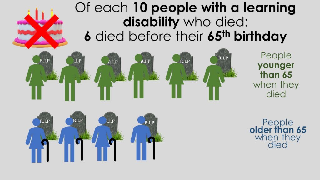
6 out of 10 people living with learning disability died before they were 65.
On average, males with a learning disability die 22 years younger than males from the general population, and females 26 years younger than females from the general population.**
But even in those key messages, there was too much information. We found that making things accessible involves taking things out. And then taking more things out. And more things. The hardest thing is deciding what to keep. So, we asked ourselves again and again: WHAT IS MOST IMPORTANT HERE?
Sometimes, on the other hand, we found that we had to put things in. Explain things. Put them into context. Why is it so important to know that only 40% of people make it past the age of 65? It’s because in the general population, it’s more like 85%.
**It’s so upsetting that these figures have barely changed… we get a similar headline year after year after year. Some people might see it as mildly positive that the average age of death for people with a learning disability is now 61 years, whilst in 2019 it was 60 years. But I am part of the much luckier “general population” and can expect to live well into my 80s, and all I can see – and my disabled colleagues with me – is the still too glaring gap of 22 years.
Step 3: Communicate your message in the easiest possible words
When we asked people what makes information easy to understand, they said “stories”. It’s probably true for all of us. Stories are so important, because they are about people, and people matter. It’s the awful stories of people who died too young, those that died avoidable deaths, that we remember and that should be the catalysts for change. Oliver McGowan. Richard Handley. Connor Sparrowhawk. They are just a few among so many, too many. Our group really understood the importance of their lives and deaths, and by implication, the lives and deaths of all the people in all the LeDeR annual reports.
But in this report, we were not talking about just one person, but about more than 3,000 people. There is an important place for the lessons we need to learn from each of their stories, but here, we were talking about averages and percentages. “Some people lived until they were 85, but many didn’t.” How to explain this?
We tried it in various ways and listened carefully to what people were able to explain back to us. What did they understand best? We ended up with this:
Of each 10 people with a learning disability who died, six died before their 65th birthday.
But of each 10 people who don’t have a learning disability, only one died before their 65th birthday.
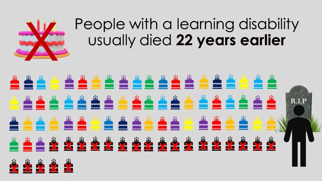
People with a learning disability usually died 22 years earlier.
The group thought about each sentence, each word. Should it be 22 years younger? or 22 years earlier? It was time consuming but worth doing, because so many times, the group improved my own attempts.
Step 4: think about INFORMATION and EXPLANATION
Most of our accessible report is information.
What was good about people’s care?
Annual health checks helped people get good care.
Learning disability liaison nurses helped people get good care.
But there were times when we thought that extra EXPLANATION was needed – sometimes this wasn’t in the main report, so we had to add it:
They are special nurses who understand what people with a learning disability need.
Chapter 5 on Avoidable Mortality was the most difficult to explain. In fact most of that part of the Easy Read version (The orange part: Could more people with a learning disability have lived longer?) is explanation, different from the main report, and probably still not quite understandable enough. This is the main report’s “Take Away” finding:
49% of deaths were rated as “avoidable” for people with a learning disability. This compares to 22% for the general population.
But what exactly is an avoidable death? How to make sense of this? Trying to explain it, I realised I didn’t completely grasp the finer details myself. As always, trying to explain things in an easy way really throws up your own shortcomings in understanding. Initially, I could not make this chapter understandable, so I had to spend some time getting my head around it. I’m not sure we succeeded in making this complicated chapter truly accessible, but we tried to make a start. It is arguably the most important chapter of all.
Step 5: Find images that REALLY explain what you are saying.
These are complicated concepts, so the words had to be supported by images that really helped to communicate the message. They should, ideally, be able to stand alone. We tested this by showing images before the words, and asking people to tell us what they thought the images were saying.
It was difficult, not least because death is so difficult and upsetting. Not making death clear was unhelpful, but was it too harsh to represent it clearly? There was no nice way of showing that over 3,000 people have died. The people in the group didn’t like the harshness of gravestones, for example, but then decided that taking away the gravestones made it less upsetting, it also made it less clear. In the end, they went for clarity.
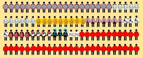
We tried several ways of presenting the numbers. We don’t claim to have got it right. Different people understood different images. One person in the group really liked pie charts, but not everyone understood those. The group initially liked this pie chart draft, but it was rejected after we had to add more pie slices (the numbers are not quite right here, but with everything added in properly, it became even more confusing): We ended up with images like this:

Explaining 61% as “six out of ten people” was easier than the more accurate “sixty-one out of a hundred” or (as one external advisor would have preferred) the actual exact number out of 3,304. Here is our final approach to the “six out of ten” message:

But throughout our Easy Read report, you will see several different approaches. That’s because we found that repeating the same concept for different messages (e.g. ten people and their gravestones) was in danger of becoming not just confusing but “boring” and “stressfull”.
The strongest image ideas came from the group. How to show, without words, that on average people died 22 years earlier? One group member said, Well, they won’t have as many birthdays. So we could show birthday cakes and then cross them out.

In the video version (see Step 6) they thought we should make the cakes quite literally disappear. We played Happy birthday over it, stopping abruptly once it had counted down 22 cakes, with a gravestone appearing. I can’t say often enough how shocking this statistic is, and how shocking it is that it has changed so little since it was first reported in 2013. When we showed the video to non-disabled people, who (like me) had read these statistics year after year, they said that it really brought home the grim reality of it. We can know things, but sometimes we need the simplest of explanations to really understand them – and it is my learning disabled colleagues who were able to point out what the LeDeR findings mean to them, personally. We won’t have as may birthdays as you.
Step 6: Create not just a paper version, but also a video
Actually, our group insisted that the video should come first. The paper version of the LeDeR 2021 Easy Read Report looks quite different from what you may be used to. It’s two or three main picture-messages on a coloured page. That is mostly because we concentrated on the video, so the paper version is really a video-on-paper. We haven’t followed the standard credo of “picture on the left, sentence on the right”. I have no idea whether this is any good, so please tell us.
The video was made using PowerPoint slides with our group members reading the text, coping admirably with the jargon. Minority ethnic backgrounds. Avoidable. Reasonable adjustments.
We have thrown convention and rule books in the wind. Whilst this was based firmly on the views and contributions of our colleagues with a learning disability and feedback from their peers, it was only a handful out of thousands and thousands of people with a learning disability who they tried to represent. As an academic researcher, I’d much rather have tried and tested everything more carefully before releasing it into the world.
So we would really love you to give us feedback. You could be our testers. Tell us what you think and we will hopefully get better and better in making Easy Read truly Easy. We need to hear this, because we think we should do more. Whilst we could only include a few key messages, we would like to say a little bit more about each coloured part, perhaps in six separate, shorter videos.
And next year, I’m afraid we will have to do the same job again. We’d love the LeDeR programme to become redundant and unnecessary, because lessons have been learnt and acted upon. I’m hoping against hope that in next year’s video, we get to keep all the birthday cakes, but change is slow and I’m not holding my breath.
In the meantime, let’s all say THANK YOU to Richard, Frankie, Lee, Maggie, Amanda, Andrew and Joanne, and all those supporting them.

